- FORUM
- PROJECTS
- ABOUT US
- RESOURCES
- CONTACT US
- FORUM
- PROJECTS
- ABOUT US
- RESOURCES
- CONTACT US
Elements of Design
- Space
- Point
- Line
- Shape (2D)
- Form (3D)
- Colour
- Texture
Space
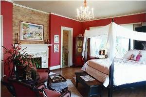
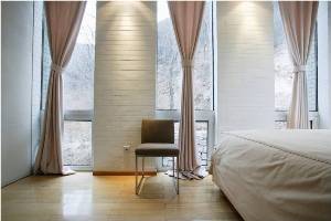
The area a designer is given to work with,The area between objects in a room,The basic space problems people encounter include having too much or, more often, not having enough.Space is probably the most important element of design. It gives us the ability to change.Space changes as we move, as light changes, or psychologically by where we are located.
To make an area feel more spacious:
allow large openings between roomsplace furniture near wallsuse small furniture, patterns and texturesuse a minimum of furnishings and accessoriesallow for empty spaces between furniture and on walls
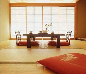
The key is to keep the eye moving in an uninterrupted way, causing our brain to think the room is larger.allow as much floor to show as possibleuse mirrors to create the illusion of spaceunify spaces by using the same floor/wall coveringsuse light, cool colorsplace lighting on the outside of the room or underneath furnitureGood space planning helps people feel more comfortable in their environments.
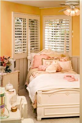
place furniture perpendicular to the wallsuse furniture of differing heightsgroup furniture according to areas of activityuse large furniture that sits directly on the flooruse large, contrasting patterns, colors and texturesuse warm, dark colorsuse natural lightinguse soft, rough textures to absorb sound
Positive vs. Negative SpaceIt is important in our designs to include both positive and negative space to achieve a look of overall balance.Positive is filled space while negative is empty space.Too much positive space can cause the space to feel cluttered.Too much negative space can cause the space to feel empty.
Point

A point is simply a location in space having neither dimensions nor substance.
Line
When a point moves through space or when two points are connected, line is generated. Line also describes a shape or outline. It can create texture and can be thick and thin. Vertical linesHorizontal linesDiagonal lines(Oblique or sloping)Curved linesActual linesContour linesImplied lines
Vertical Lines
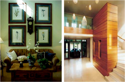
These suggest stability and immobility and by extension dignity and permanence.Vertical columns of a building suggests its solidity and permanence.Strong vertical lines — in a picture, in a frame, or in the arrangement on the wall add to the feeling of height in a room.
Horizontal Lines
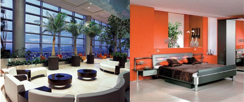
These suggest rest and repose.Floors and ceilings are the surfaces that give spaces their sense of reassuring normality
Diagonal (Oblique or sloping) Lines
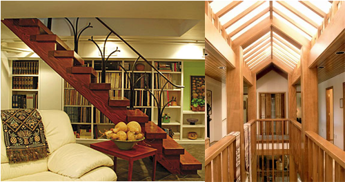
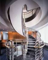
These suggest movement, dynamic forces and activity.A sloping ceiling or staircase makes a space seem active, lively
Curved Lines
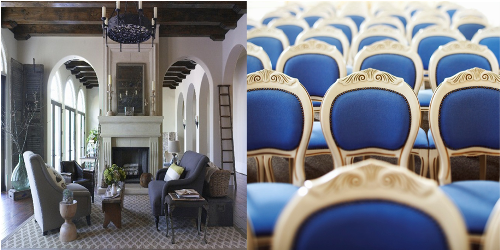
The path of moving point that continually changes its direction gives a curved line.Curving lines suggest softness and freedom and feminine appeal
Contour Line
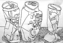
Varying the thickness or thinness of a line can add interest and give a sense of 3-Dimensionality. Here, the thick lines of this drawing represent the shadows or darker areas of the seal.

2D Forms (Shapes)
Planes are 2 dimensional with length and width.They lie completely in one planeShapes are flat and can be grouped into two categories, geometric and organic (free form).
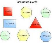

Geometric shapes can be defined by a mathematical formula. ( L x W = Area ).Organic or freeform shapes have no particular formula to how they are created.
3D Forms
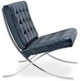
Adding depth or volume to a 2D form creates a 3D form.Furniture, columns or stairs and buildings are 3D solids.
Texture
It is about surface quality either tactile (they way it feels) or visual (the way it looks). Texture can be real or implied by different uses of media. It is the degree of roughness or smoothness in objects..

1 Comment
good article a new designer can adopt this.