- FORUM
- PROJECTS
- ABOUT US
- RESOURCES
- CONTACT US
- FORUM
- PROJECTS
- ABOUT US
- RESOURCES
- CONTACT US
Principles of Design
SizeScaleProportionHarmony, Unity, Variety, ContrastBalanceRhythmEmphasisPattern and Ornament
Size
Things are large or small in relative terms. A large living room is smaller than a large church, but appears large in relation to an adjacent small entrance hall.
Scale
It is the proper proportion of an object to all other objects, to human beings and to the space to which it belongs.Small pieces of furniture often look lost in a large space, while large objects may seem overbearing when crammed in to a small room.Good scale is indicated when things look so right that the issue does not even come to mind.
Proportion
It is the relationship of parts of a design to each other and to the whole.A well proportioned room looks visually right. A bad proportioned room may seem too long and narrow or an element such as a door, window, or a piece of furniture may appear awkwardly placed.
Harmony Unity Variety
Harmony is the relation of varied components of an interior to each other and to the overall theme of the design.Unity allows the viewer to experience a design as a whole rather than seeing it as a collection of elements.All the parts of the design will relate so well as to create a unit in which, nothing can be added, taken away, or altered without changing the totality.Variety and contrast can relieve monotony , giving the eye a number of different shapes, textures, colors or details to look at. Contrast heightens values through comparison.

Pattern
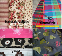
A patterned surface has visible presence in every part of its extent.The fact that pattern is usually repetitious gives it rhythmic qualities on a small scale.The elements of a pattern can convey messages.Little flowers and regular stripes create very different moods.Geometric squares and naturalistic curves imply different attitude.Pattern has the ability to hide or minimize soiling and visible traces of damage.

Ornament
Ornament refers to visual extras unnecessary for practical reasons but added to show off craftsmanship, introduce variety, and enrich a uniform surface.Good ornament emphasizes what is important, draws attention to what is significant, and tells something about the materials and workmanship involved.Moldings at a cornice or baseboard strengthen the line of intersection of walls, floor, and ceiling.Moldings and motifs of classical designs the carved columns and leaves are examples of ornaments showing the craft skills.

Balance
Balance – is a feeling of visual equality in shape, form, value, color, etc. Balance can be symmetrical or evenly balanced or asymmetrical and un-evenly balanced. Objects, values, colors, textures, shapes, forms, etc., can be used in creating a balance in a composition.Formal/symmetrical – Both sides are the same, mirror imageInformal/ asymmetrical – Sides are different but visual weight is still equal

Rhythm
Rhythm relates visual elements together in a regular pattern.It can be achieved by Repetition, Gradation, Opposition, Transition, Radiation.Repetition — a design tool (usually one of the elements of design) is repeated.Transition – how one part of the design changes to another part. Usually a distinct curved line will guide the eye.Radiation — moves your eye out from a central pointGradation—moves the eye from light to dark or from small to large with one or more of the elements.Opposition – an abrupt change in color or line that keeps moving the eye.

Contrast
Contrast is the difference between two values. It offers some change in value creating a visual discord in a composition. It can also be used to create an area of emphasis.

Emphasis
Emphasis ensures that important elements look important and trivial elements look subordinate.The focal point of a room.Architectural emphasis (using windows, staircases, fireplaces, etc.) is a great way to create a focal point in a room.
